• Skip to primary navigation
  • Skip to main content
  • Skip to primary sidebar

An Antic Disposition

  • Home
  • About
  • Archives
  • Writings
  • Links
You are here: Home / 2013 / Archives for May 2013

Archives for May 2013

Who wants to develop OpenOffice for Tablet?

2013/05/29 By Rob 2 Comments

One of the most common user questions I see on the Facebook and Twitter streams for Apache OpenOffice is “Do you have a iPad version?” or “Do you have a tablet version”?   Although there are companies that offer access to OpenOffice via a virtualized remote session, there is no native tablet version of OpenOffice.

I have received questions, behind the scenes, about the feasibility of starting such an effort at Apache.   Of course, creating a tablet version of OpenOffice, a competitive application with a first-class native touch UI,  with platform integration and optimization, is a  non-trivial effort.    My impression is that there are several companies, small and large, that would find this to be an intriguing possibility.  But the task is too large to do it alone.  But with several companies involved,  as a joint effort, in an open source project, then this becomes possible.

Imagine if we had such an open source tablet version of OpenOffice available today.   It would be an app that everyone would want.  If done right the OpenOffice app would be at the top of the charts just as the desktop OpenOffice is one of the leading open source desktop apps.  The app itself would be free, of course.   But it would be an open platform that we could all build upon.

Possible business models might include:

  • Cloud services related to documents, range from storage to sharing and collaboration
  • Extensions to the app, in-app purchases of additional templates, content, etc.
  • Advertising-supported apps.
  • From service provider perspective, avoidance of licensing fees for competing commercial office software.
  • A “white label” version that can be rebranded per customer

There are good reasons, I think, for doing such work at Apache, including:

  • Existing expertise in the OpenOffice product
  • Proven community development culture based on The Apache Way
  • Permissive, commercially-friendly Apache License, the preferred license for Android userspace
  • Strong brand / name recognition

I’d like to have a discussion with those having a serious interest in making a tablet version of OpenOffice.  By serious, I mean those who might be willing to contribute developers to a larger effort, if such an effort were to materialize.  I’m happy to talk one-on-one.  And if there is sufficient serious interest from multiple parties I can broker a meeting of interested parties to discuss further options.

If any of this sounds interesting and you want to register your interest please send me an email at robert_weir@us.ibm.com.

  • Tweet

Filed Under: Open Source, OpenOffice

The Power of Brand and the Power of Product, Part 1

2013/05/13 By Rob 2 Comments

“Essentially, all models are wrong, but some are useful” said G. E.P. Box of Box-Jenkins fame.  Today we’re going to look at a model of market share, and I hope it is a useful model.  One nice property of it is that it is very easy to estimate the parameters of this model.  A single survey question will do.

This model should be intuitive to various groups, especially financial analysts and space enthusiasts.  The former might recall DuPont analysis of Return on Equity, by which ROE is expressed as a product of business ratios such as margin, turnover and leverage.   And space enthusiasts might recall the Drake equation, which estimates the number of intelligent civilizations in the galaxy, also as a product of various factors, such as the rate of star formation, and average number of planets per star.  Both models are useful, not only for estimating the value of interest, but because the factors themselves have interesting interpretations and tell us something about the system being modeled.

In our model we look at a funnel process that describes the actions that must occur for someone to become a regular user of a product.

market-funnel

We start with the universe of potential customers, everyone who might have a need for your product.

Then the person must be aware of your product. They need to know it exists.

(Note there are other models that start even earlier, that the potential customer must first be aware that they have a need.   For example, those selling medicines go through great lengths to convince people that flaky toe skin is something that requires urgent attention.)

Then the person must be convinced to try your product.   Even free products require some incentive for their time and effort. Why try?  Why now?  Is it safe?   Some will be motivated to try and some will not.

Of those who try, some will have a good experience and continue to use your product, and others will have a bad experience, or insufficiently good experience, and will not continue to use your product.

Those at the end of the funnel who continue to use your product, as a fraction of the total potential market at the top of the funnel, that is your market share.

Where it gets more interesting is when you express this as a product of factors, as in:

Market Share = Customer Awareness * Customer Motivation * Customer Satisfaction

Awareness tells you, of those who are in your market, what portion has heard of your product?  This is a measure of the value of your brand, including advertising and word of mouth.

Motivation tells you, of those who have heard of your product, what portion has even tried it?  This is a measure of the timeliness and fit of your product to the market.  Pricing strategy and promotions/incentives also factor in here.

Customer satisfaction tells you, of those who have tried your product, what portion remain customers?  This is a measure of how well your product meets the promises and expectations laid out in earlier stages of the funnel.

As you can see, the first two factors relate mostly to your brand and marketing efforts, while the last factor, Customer satisfaction, relates to your product.   So by identifying these individual factors you can look at the relative power of your brand and your product.  Do you have a great product that no one knows about?  If that were the case the awareness numbers would be low and the satisfaction numbers would be high.  Are you targeting the wrong users in your marketing efforts?   That would show up as high Motivation scores and low Satisfaction scores.  That could also indicate product quality issues.  There are many different combinations, and the values of these factors, and their trend over time, can tell you much.

Now here is where it gets interesting.   You can estimate all of these factors, Customer Awareness, Customer Motivation and Customer Satisfaction, and Market Share as well,  with a survey of a single question, a question that with responses that match the structure of your funnel.

The question to ask is of the form:

“What is your awareness with the hand cream called Whizzo-Soft?”

A. I have never heard of it.

B. I have heard of it but I have never tried it.

C. I have tried it once.

D. I use it sometimes.

E. I use it regularly.

There are variations on the scale to use, sometimes only four choices, sometimes more, depending on whether you want to make distinctions among occasional versus regular customers.

Note that this requires a real, random survey of your target market.  A poll on your website where visitors self-select will obviously bias the results.   For this to work you really need to survey a random sample of your target market.

Once you have done this the math is easy.  If you have N total responses , and the number of responses for the questions are A ,B, C, D and E, then:

  • Customer Awareness = 1 – A/N
  • Customer Motivation = (C + D + E) / (N -A)
  • Customer Satisfaction = (D + E)/(N – A – B)

In Part 2 of this post, I’ll show a worked out example, including interpretation,  using data from a  recent random survey that looked at OpenOffice and LibreOffice awareness and use.

  • Tweet

Filed Under: Marketing

Mapping the ASF, Part II

2013/05/06 By Rob 1 Comment

In my last post I showed you one view of the Apache Software Foundation, the relationship of projects as revealed by the overlapping membership of their Project Management Committees.  After I did that post it struck me that I could, with a very small modifications to my script, look at the connections at the individual level instead of at the committee level.  Initially I attempted this with all Committers in the ASF   This resulted in a graph with over 3000 nodes and over 2.6 million edges.   I’m still working on making sense of that graph.  It was very dense and visualizing it as anything other than a giant blob has proven challenging.  So I scaled back the problem slightly and decided to look at the relationship between individual members of the many PMCs, a smaller graph with only 1577 nodes and 22,399 edges.

Here’s what I got:


As before I excluded the Apache Incubator, Labs and Attic, but looked at all other PMC members.  Each PMC member is a dot in this graph, with a line connecting two people who serve together on a PMC.  The layout and colors emphasizes communities of strong interconnection.  An SVG version of the graph is here.

Each PMC is a “clique”, a group that strongly interacts with itself.  But aside from a small number of exceptions, which you can see at the top of the graph, each PMC has one or more members who are also members of other PMCs.    In structural terms they are “between” the two communities and help connect them.  This could mean various things in social terms, from acting as a conduit of information, a broker, or even a gatekeeper.  The person who introduces you to new people at a party serves the same role as the person who tells the prisoner stories of the outside world.  The context is different, of course, but in either case, the structural position is one of importance.

A common way of quantifying the importance of the nodes that connect other nodes, is via a metric called “betweenness centrality“, which you can think of as a measure of how many shortest paths between other nodes pass through that node.  If the shortest path is always going through you, then you have high betweenness and you’re helping connecting the disparate parts of the organization.

Let’s draw the graph again and show each node with a size proportionate to its betweenness.  You can see more clearly now the position of the high betweenness nodes and how they bridge sub-communities.

Now of course, the structural role doesn’t necessarily equate to the actual social role.  Someone could be inactive or lurking in multiple projects and not serve as the conduit of much of anything, though on paper they appear central.   But Apache participants might take a look at this larger version of the chart, where I have labeled the nodes, and see how well it matches reality in many ways.

  • Tweet

Filed Under: Apache, Social Network Analysis

Mapping the Apache Software Foundation

2013/05/03 By Rob 2 Comments

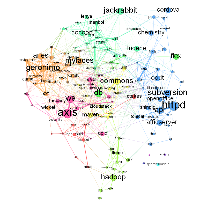
So, what do we have here?   This is a graph of Apache projects and how they are related, by one definition of “related” in any case.  Click on the image for a larger PNG version, or here if you would like an SVG.

Each labeled circle (node) in the graph represents one project at Apache.  Or to be specific it represents the membership of a single Project Management Committee (PMC),  the leadership committee that each Apache project has.  The size of the node is proportionate to the size of the PMC.    You can see that the largest PMCs are Apache Axis (56 members),  Httpd (55 members), Subversion (42 members), WS (41 members) and Geronimo (also 41 members).

The edges between the PMC nodes represent the ties between the PMCs as revealed by overlapping membership.  So PMCs that have a larger number of members in common have a thicker line connecting them.  I used the Sørensen–Dice coefficient to express the overlap.  This is a simple calculation that looks at the overlap in membership of two sets, scaled by the size of the individual sets.  It varies from 0 to 1,  with 0 meaning no overlap at all and 1 meaning total overlap.    An example:  Look at the bottom of the graph at the thick line connecting Apache Flume and Sqoop.  The Flume PMC has 20 members and the Sqoop PMC has 13.  They have 6 members in common, so the Dice coefficient is (2*6)/(20+13) = 0.36.   The highest weight edge in the graph is that between Apache Httpd and the Apache Portable Runtime (APR), with a coefficient of 0.52.

(Observant Apache participants will note that the chart is missing some PMCs.  I omitted Apache Labs, Incubator and Attic since they are umbrella projects representing parts of a project lifecycle.  They don’t have a specific technical orientation and the commonality in membership would not mean anything.  I left out Comdev as well, for the similar reasons.)

The color for each node was determined by a community-detection algorithm (modularity) which finds projects that have a high degree of interconnection.  This has brought out some of the larger trends within Apache, such as the grouping of cloud-related projects, big data related ones, content management,  enterprise middleware, etc.  What is interesting is that this graph was created without knowing anything at all about the technology within each project.  The graph is based on PMC membership data only.  So individual volunteers, by their choice of what projects they work, is the motive force behind these groupings.

Some other interesting facts:

  • The PMCs with connections to the most other PMCs are Commons (34), WS (32), DirectMemory (31), Aries (28) and Geronimo (28).
  • If you look at the most connections to other PMCs (subtly different from the above since it is possible to have more than one member in another PMCs) the top projects are: DirectMemory, Karaf, Servicemix, BVal and Geronimo.
  • Betweeness centrality looks at the importance of a node with respect to helping connect other nodes.  It looks at the shortest path between all pairs of nodes, and which specific nodes are most often the ones that are passed through on these shortest paths.  If we were looking at a graph of air traffic routes, the hub cities would be the ones with the highest centrality.  If we were looking at how to communicate an idea, influence opinion, or to spread an infectious  disease (all the same thing, really), these central nodes are ones to look at.  The PMCs at Apache with the highest betweeness are: Commons, DirectMemory, WS, Httpd and Portals.

So how did I do this?

The core data I got from scraping this page, which lists all Apache committers.  I did this in Python using BeautifulSoup, building up the PMC membership in a dictionary.  Then Python’s set operations made calculating the Dice coefficient a simple task:

    intersect = SetA.intersection(SetB)

    dice = (2.0*len(intersect)/(len(SetA)+len(SetB)))

The script then wrote out the graph data, include node size and edge weight into a Gexf-format XML file, which I then processed using Gephi.  Here’s the data file I used if you want to play with the data yourself.

In Part II of this series, I’ll take a look at finer-grained data, at the social network graph of Apache Software Foundation participants at the individual level.

  • Tweet

Filed Under: Apache, Social Network Analysis

Primary Sidebar

Copyright © 2006-2023 Rob Weir · Site Policies


Loading Comments...