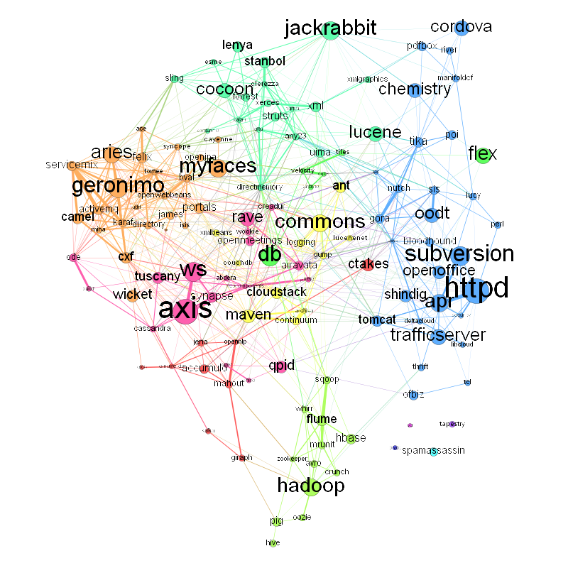
So, what do we have here? This is a graph of Apache projects and how they are related, by one definition of “related” in any case. Click on the image for a larger PNG version, or here if you would like an SVG.
Each labeled circle (node) in the graph represents one project at Apache. Or to be specific it represents the membership of a single Project Management Committee (PMC), the leadership committee that each Apache project has. The size of the node is proportionate to the size of the PMC. You can see that the largest PMCs are Apache Axis (56 members), Httpd (55 members), Subversion (42 members), WS (41 members) and Geronimo (also 41 members).
The edges between the PMC nodes represent the ties between the PMCs as revealed by overlapping membership. So PMCs that have a larger number of members in common have a thicker line connecting them. I used the Sørensen–Dice coefficient to express the overlap. This is a simple calculation that looks at the overlap in membership of two sets, scaled by the size of the individual sets. It varies from 0 to 1, with 0 meaning no overlap at all and 1 meaning total overlap. An example: Look at the bottom of the graph at the thick line connecting Apache Flume and Sqoop. The Flume PMC has 20 members and the Sqoop PMC has 13. They have 6 members in common, so the Dice coefficient is (2*6)/(20+13) = 0.36. The highest weight edge in the graph is that between Apache Httpd and the Apache Portable Runtime (APR), with a coefficient of 0.52.
(Observant Apache participants will note that the chart is missing some PMCs. I omitted Apache Labs, Incubator and Attic since they are umbrella projects representing parts of a project lifecycle. They don’t have a specific technical orientation and the commonality in membership would not mean anything. I left out Comdev as well, for the similar reasons.)
The color for each node was determined by a community-detection algorithm (modularity) which finds projects that have a high degree of interconnection. This has brought out some of the larger trends within Apache, such as the grouping of cloud-related projects, big data related ones, content management, enterprise middleware, etc. What is interesting is that this graph was created without knowing anything at all about the technology within each project. The graph is based on PMC membership data only. So individual volunteers, by their choice of what projects they work, is the motive force behind these groupings.
Some other interesting facts:
- The PMCs with connections to the most other PMCs are Commons (34), WS (32), DirectMemory (31), Aries (28) and Geronimo (28).
- If you look at the most connections to other PMCs (subtly different from the above since it is possible to have more than one member in another PMCs) the top projects are: DirectMemory, Karaf, Servicemix, BVal and Geronimo.
- Betweeness centrality looks at the importance of a node with respect to helping connect other nodes. It looks at the shortest path between all pairs of nodes, and which specific nodes are most often the ones that are passed through on these shortest paths. If we were looking at a graph of air traffic routes, the hub cities would be the ones with the highest centrality. If we were looking at how to communicate an idea, influence opinion, or to spread an infectious disease (all the same thing, really), these central nodes are ones to look at. The PMCs at Apache with the highest betweeness are: Commons, DirectMemory, WS, Httpd and Portals.
So how did I do this?
The core data I got from scraping this page, which lists all Apache committers. I did this in Python using BeautifulSoup, building up the PMC membership in a dictionary. Then Python’s set operations made calculating the Dice coefficient a simple task:
    intersect = SetA.intersection(SetB)

    dice = (2.0*len(intersect)/(len(SetA)+len(SetB)))
The script then wrote out the graph data, include node size and edge weight into a Gexf-format XML file, which I then processed using Gephi. Here’s the data file I used if you want to play with the data yourself.
In Part II of this series, I’ll take a look at finer-grained data, at the social network graph of Apache Software Foundation participants at the individual level.

Thanks so much for this image!