1920 was the 300th anniversary of the landing at Plymouth of the Puritan separatists. In commemoration of this tercentenary, three stamps were issued based on designs by the Bureau of Engraving and Printing’s chief designer, Clair Aubrey Huston. Let’s take a closer look.
The 1-cent green “Mayflower” (Scott #548) was based on a photograph of a ship model held by the Smithsonian Institution. Perhaps this historic photograph is close to what Huston used as a model. I wonder if the stamp design was intentionally reversed to have the ship coming from the right, which in our Northern hemisphere minds is necessary to symbolize travel from the East?

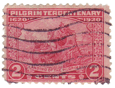
The 2-cent carmine rose “Landing of the Pilgrims” (Scott #549) was based on the reverse of the $5 Federal Reserve Notes series of 1914. You can see that design here.
The 5-cent deep blue “Signing of the Compact” (Scott #550) was based on a painting by the Massachusetts painter Edwin White. White is better known for his painting, “Washington Resigning His Commission” which is in the Maryland State House.
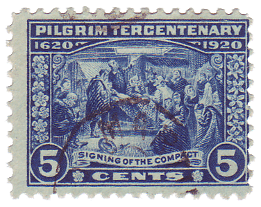
Note the unifying ornament in the vertical borders, and flanking the word “cents”. This looks very much like the official Massachusetts state flower, the Mayflower.
All three of these stamps share one common trait. Or more precisely, they all lack something that every other U.S. stamp has. Can you spot what is missing? Here’s a clue: Stamps of Great Britain lack this feature as well.
A true Thanksgiving stamp was not issued by the USPS until 2001. I don’t know about you, but I like the old engraved designs better. Today’s stamps look too much like Pokémon stickers.