Time-Based Profiling
Before any of this will make sense, I ask you to imagine doing a survey of your local shopping mall or other busy commercial shopping district. You want to know where people congregate, where they spend most of their time. Is it in a particular shop, in the food court, or in some dark corner of the parking garage?
There are a few ways of solving this problem:
- You could have a video capture of the entire complex, digitize that data and map where everyone is. Aggregate over a representative time interval (days? weeks?) and you will have a good idea where people hang out. The downside of this approach is that it requires an expensive and complex camera system, and generates a massive amount of data.
- Another approach would be to do this with a series of still cameras that cover the entire mall. Take a snapshot at period intervals. A bit less expensive, but still requires “getting everyone in the frame”.
- Yet another approach is to sample both by time and by location. So don’t install cameras all over the mall. Have one hand-held camera, and take a picture in the book store one minute, another picture in the food court another minute, etc. Aim for coverage over time and locations. And repeat, repeat, repeat. Take thousands of samples. This is low tech on the data capture side, but can still generate massive amounts of data.
So three approaches. Obviously some approaches are easier to implement for the owner of the mall. But only the last one is doable by the average citizen.
This is essentially the situation we find ourselves in with Twitter. They do have APIs that can be used to query their user data. But it is all “rate-limited”, meaning only a certain number of requests can be made per IP address per day. So it is impossible to get a running stream of all activity (a “video”) or even a snapshot of all activity at a single time (a “still camera”). But what we can do is access the “Twitter Public Timeline“, which will give you the most recent 20 tweets. This can be queried every 60 seconds, up to your daily limit.
I’ve been capturing the Twitter Public Timeline since late 2009. I have now nearly 6 million records, each one containing the message, of course, but also the name of the user and their “Followers” and “Following” count at that point in time. I started doing scatter plots of this data and was amazed at the detailed structure evident in the data, that illustrate some interesting ways in which Twitter is being used. No single graph can show it all, so I’m giving you a series of charts, each one showing an area of the Following/Followers phase space 10x larger.
All charts here were done using the open source R environment.
One Thousand Followers
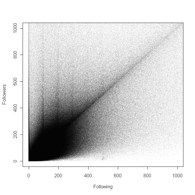
In this chart each pixel represents one Twitter user, plotted at a position reflecting how many people they are Following, and how many Followers they in turn have. This chart is zoomed in to show only those whose Following/Follower counts are 1000 or fewer.
We see a few trends here. First, there is a predominance of users with counts less than 300 or so. But we also see a strong trend toward parity in counts. That is the line going up to the right at 45 degrees. This would be expected for socially-interacting groups of mutual followers.
What I did not expect were the “spikes” for users who follow 100, 200 and 300 accounts. This is not an aliasing artifact of the graphing. This is real. Is there something out there that would lead large numbers of users to follow exactly 100, 200 or 300 users?
(For those of you interested in how the chart was created, I used alpha blending to deal with the “overplotting” problem. So each point is plotted in a partially transparent way, so an area gets darker the greater the density of points. If I didn’t do that, the entire chart would be one giant blot of black, with no discernible patterns. I also introduced random “jitter” between -0.5 and 0.5 to avoid false patterns caused by integer quantization interacting with screen resolution.)
Ten Thousand Followers
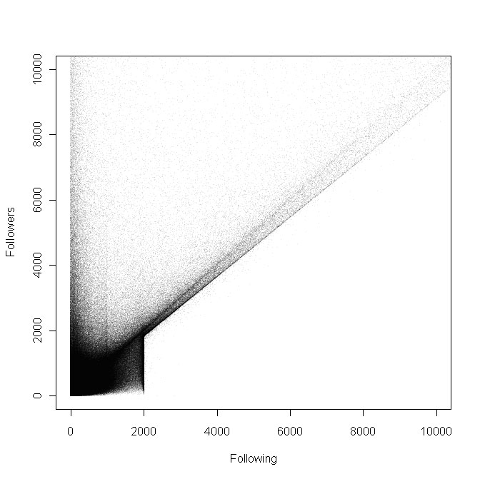
Moving out a factor of ten, we now look at those users who have 10,000 or fewer followers. Again, each pixel represents one sampled user. The entire previous chart would fit in to the lower left corner.
The salient feature here is the hard cut-off at 2000. This is due to Twitter’s “aggressive following” limitation: “Once you’ve followed 2000 users, there are limits to the number of additional users you can follow: this limit is different for every user and is based on your ratio of followers to following.” They are a bit coy about what exactly the rule is, but a look at the chart certainly suggests that having a Following/Followers ratio > 1 is going to be a problem.
We also see an unexplained density of people Following exactly 1000 users.
One Hundred Thousand Followers
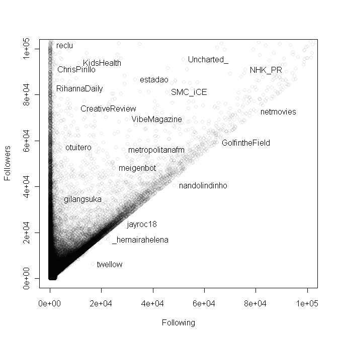
Another factor of 10 and we switch to a different presentation, representing users with small circles rather than pixels. We’re now starting to see recognizable users and information sources. I’m illustrating some account names at random. Maybe not exactly celebrities, but there are some broadly followed users here. Since the only way to follow 100,000 users is to have close to that number already following you, the lower right half of the chart is empty, and will remain so as we continue to zoom out.
The structure here seems to be:
- Information pushers who follow nearly no one, up the y-axis on the left.
- Users who follow almost everyone who follows them, running diagonally
- Nothing much in the middle
One Million Followers
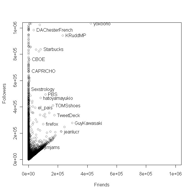
Zooming out another factor of 10, and we see that the Following count trails off. Does Twitter have another limit here? Or do people realize that it is pointless to follow 500,000 people? But why wouldn’t they also see that it is senseless to follow 50,000 people?
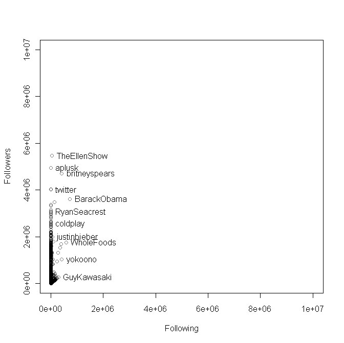
Ten Million Followers
And in the last chart we take it out one more order of magnitude, and the Twitterverse recedes to be Ellen DeGeneres, Britney Spears, Barack Obama, Justin Bieber and Ashton Kutcher. If you are an average Twitter user, like me, everyone you know and actually interact with on Twitter is represented by 1/20th of a pixel in the lower left corner of the chart.
Note that this chart (and the previous) one does not reflect the current Follower/Following count for these particular users. This is not a concurrent snapshot. This was all sampled over an 18 month period of time. Different users are necessarily shown according to their status at different dates. The point is to show the structure of the data, not make a claim that, e.g., Ellen DeGeneres has more followers than Justin Bieber.
Very nice bit of work, here. I can offer one comment on the hard lines at 200, 300 and so on – I regularly tell myself I’m following too many people, and that I should stop adding to my feed. For a while I succeed, then I come across someone really, really interesting, and my discipline crumbles. More often than not I impose these short-lived attempts at discipline when my follower count is at some arbitrary round number.
I would surmise that I’m not alone. That those ‘hard’ spikes don’t represent fixed groups of twitterati (nothing very much about twitter is really fixed) but simply a transient stopping point for a larger number of us, on our way to aggregating ever greater numbers of followees.
Nick, I suspect you may be right (unless there’s some twitter client software out there that has limits for one reason or another).
Personally, I follow less than dozen accounts. Considering how little time I choose to dedicate to reading the twitter feed, anything more becomes somewhat pointless for me.
Rob, great data analysis here. Thanks.
Bern, one way to follow more folks and still have value is to use lists. Group accounts into topics, regions, or genres and you can quickly scan through the most important accounts you follow.
Fantastic visualizations! Great work.
Hi,
an interesting read that I just stumblet upon here, thank you for that!
I did not quite get the idea of introducing jitter to the charts.
Could you point to some info on that? It just seems interesting.
About those spikes at units of 100, 1000 et cetera : did you happen to capture the source of those tweets. We could get down to the nitty-gritties of the softwares and their limits, then.
Love it!
How do the results look if you squeeze the whole lot into one chart on a logarithmic scale? I guess you’d need to set zero values as 0.5 or something like it to actually plot those.
I bet another interesting variation would be to segment the users by how active they are. Maybe create 3 versions of the same chart and put them side by side, for each of low, medium and high number of total tweets? That would convey a sense of the relationship between tweets, followers and followings.
And what’s with that cluster at 500 following, 0-10 followers?
The speculation about the 100, 200, 300 in the comments is funny. Those round numbers are clearly bots programmed to follow exactly that many users. When you are making bots for a service you don’t want to be discovered so you create many accounts and split the load between the accounts, choosing a cutoff point, at say, something like 200 followers and scale outward.
Why not write a bot that follows a random number of people? If I don’t want my “service” to be discovered, wouldn’t 500 or 5000 or more accounts following exactly 100 people be a huge red flag? This conjecture seems as dubious as any of the others.
Because not all programmers are smart. Most don’t even write their own code. And these basic bot scripts are probably easily available for download.
Also, and more likely, these are not bots but accounts created by real people in those “click/traffic farms”. They create 100s of accounts per day per employee. Each account then follows 100, 200, 300 or any other multiple of 100, since that’s easier to explain to a completely unskilled person in Asia instead of explaining them how they have to follow in random numbers. And the accounts that are sold are also amongst the same ones (the ones they follow are also following the same 100 multiple number of accounts). I mean you’ve already created an account to be followed by a large number of fake followers, might as well use this same account to generate more follows as well. This would maximize utility per account created which is critical as creating the account is the most resource intensive part of the operation, following is relatively easy.
Twitter is probably aware of all of this, but they shouldn’t bother since its just more traffic, more traffic is a good thing.
That should be “Barack Obama.”
Hello! I just wanted to let you know that I posted this to /r/dataisbeautiful on reddit at http://redd.it/2jxp39 and it is getting a great response. I hope that’s ok!
I bet the spikes at 100, 200, 300 might represent accounts automatically generated for use as internet marketing purposes. (ie. Someone uses software/paid service to generate fake accounts to follow their real account to help it appear more popular. Their real account then configured automatically yo follow a certain number of other accounts to try and hide the more easily detected pattern of an account with many followers who is not following anyone.)
Looking without glasses, I also notice spikes at 400, 500 and 600 :)